Live Stream App Integration
Overview
Ticketmaster (www.ticketmaster.com) is an American ticket sales and distribution company based in California with operations in many countries around the world. The company clients include venues, artists and promoters and they have full control of their events, set their own ticket prices and make them available for Ticketmaster to sell.
Problem
Due to the impacts of COVID-19, many live shows have been canceled and Ticketmaster has received negative press coverage over appeasing customers. The large majority of global live music goers say they want to return to concerts, and many fans have opted to keep tickets for rescheduled shows over refunds.
COVID-19 has caused thousands of artists to cancel upcoming shows and festival appearances. Additionally, millions of fans have been without live entertainment for months.
Project Plan
My role: Project Manager, UX Designer, Visual Designer, Researcher
As a Project Manager I created a plan that would allow us to work together as a team but also give me the opportunity to serve as the main Visual Designer. We were able to share ideas and collaborate at the same time so I could get constant input from my team. This allowed me to make better design decisions, keep the project on track, delegate tasks to meet our deliverables and finally present our finished product.
Team: 4 UX/UI Designers and researchers
Tools: Marvel, Adobe XD, Photoshop, Miro, Trello, Zoom, Slack, Google Docs
Client: Ticketmaster
Client's goal: To establish user needs and create a mobile prototype that allows users to purchase and attend live sets and festivals remotely
Methodology: Heuristic Evaluation, Research: User Interviews (8 participants), Competitive and Comparative Analysis, Prototyping and Usability Testing
Discover and Research
As part of our initial company research we discovered that Ticketmaster reported that its revenue for the second quarter this year dropped 98% from the same period in 2019 due to the corona-virus shutdown. It was up to our team to not only provide a new delightful user experience to regain trust in the company but also to focus on increasing revenue.
We decided to interview eight people via Zoom that were frequent event goers before the pandemic began and people that are also still interested in continuing to support their favorite artists.
Research goals
Find out:
•What were the user's socializing and event attendance habits pre and post pandemic.
• Why users or event goers like to attend events in general.
• How the pandemic has affected their social life and what they miss the most from attending events in person.
• How was their experience purchasing tickets in multiple platforms including Ticketmaster.
• Find out if they watched live stream shows/events.
• What type of artists they support.
Competitive/Comparative Analysis
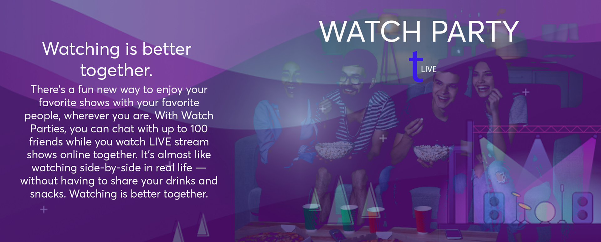
I did an assessment and inventory of the strengths and weaknesses of our competitors' features and their current products. I learned that Amazon and Ticketmaster have a strong partnership, something that was going to be beneficial for our project. Through their web services they can power any type of integration and we can build similar features offered by them like the "Watch Party", we can sell merchandise, and more importantly host live streams shows at a low cost.
Heuristic Evaluation
We conducted a heuristic evaluation of the current Ticketmaster app to measure how usable the app is and to identify usability issues. This is what we found:
•The existing Ticketmaster mobile application is very consistent in design, color and iconography.
•Issues arose quickly when in-app links led users out of the mobile application into outside sites and extensions.
•The only live-stream offering consists of a link to LiveNation mobile site within Ticketmaster App.
•Once on the LiveNation mobile site, users are then directed to further outside platforms for video hosting and live-streaming.
•No attempt is made by either Ticketmaster or LiveNation to keep users within their mobile platforms to purchase and attend live stream experiences.
Affinity Mapping
To synthesize and make sense of all the raw data we collected through the User Interviews and the Competitive/Comparative Analysis we organized all these ideas by grouping them in trends and behaviors. I organized the map so it would be easy for us to spot the connections and patterns between them. I refined and labeled the groups so we could understand the main pain-points for our users:
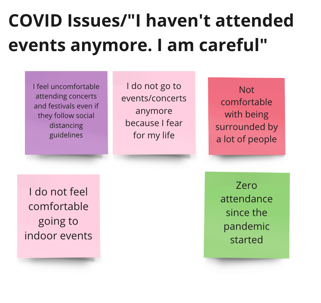
•Users aren't attending events because they don't feel safe due to the pandemic.
•They don't think a live stream show could replace or give them a realistic experience.
• They can't hang out with friends or family or enjoy meals and drinks together while they see their favorite artists perform.

Key User Insights
Analysis and Synthesis
After performing eight users interviews we discovered that most of them haven't attended any live events or even live stream ones due to COVID-19 mainly but also due to the lack of shows being promoted on social media and a good platform that could host them.
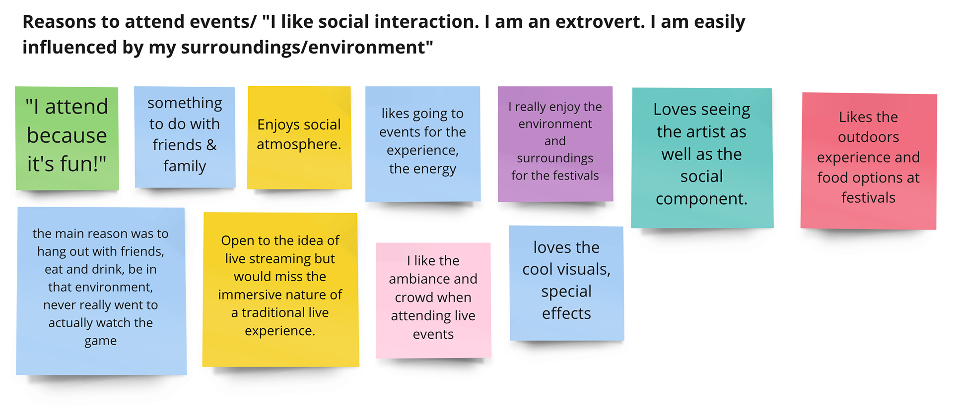
We also learned that users wanted to continue supporting their favorite artists in any way possible and that they all loved the in person live experience better because of the social interaction mainly. They enjoyed being there with their friends or family, the sound quality, buying merchandise and music and also being able to buy tickets in the easiest way possible.
Objectives:
• Understand user behavior when attending live shows in person
• Discover pain points associated with live streaming
• Uncover how the competition is addressing user's pain points
• Conceptualize ways to increase attendance to virtual shows
Goals:
• Business: Increase revenue for Ticketmaster
• User: Recreate the in-person experience at a live event
Persona
Rick, 26 years old, Marketing Freelancer
"Music is my life!"
"A live stream show would never be the same as a live show!"
User Needs & Goals:
• He needs a safe way to continue socializing with his friends while enjoying music by his favorite artist and have access to high quality live streaming shows.
• He wants to continue supporting the artists he loves because the industry has been heavily affected by the pandemic.
Behavior:
•An extrovert person that loves socializing and spend quality time with his friends and family.
•He used to go out to concerts and festivals to see his favorite artist but he hasn't attend any events since the pandemic started.
•Has been trying to find live stream events to attend but hasn't seen much activity on social media.
Frustrations:
• Can't attend events due to COVID-19.
• Can't find a proper live streaming service.
• Doesn't get news about shows.
• Can't socialize with friends.
Current Userflow - Facebook Live Stream
Content Inventory and Utility Navigation
We listed the content of Ticketmaster app to catalog each piece and do an assessment of this information. This helped us understand if the content of our experience was integrated in the right way, to prioritize the pages we wanted to focus on, to notice if some pages needed to me removed, if the content needed to be reviewed and how we were going to redirect the users to the new Ticketmaster Live home and to the new live stream feature.
For the Utility Navigation we wanted to make sure our user could move and interact with our content in an easy and intuitive way to achieve the specific goals of purchasing tickets and attending a live streaming show while socializing without any issues.
Problem Statement
Our Solution
We believe that by adding our integration and building these features to the current Ticketmaster app for fans and event goers we will achieve the following:
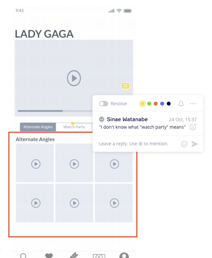
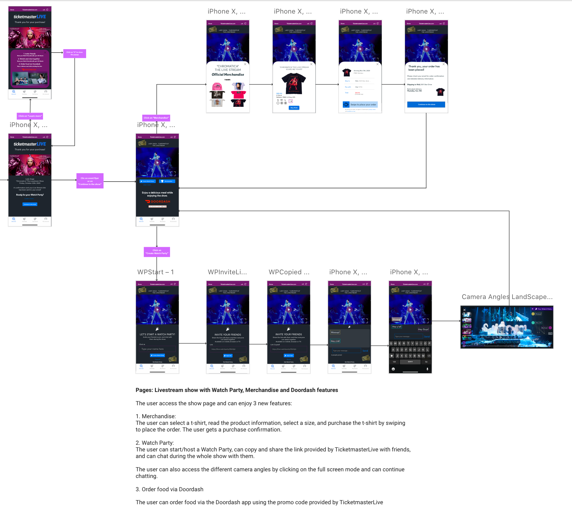
•Will make the live stream experience feel more real by having alternate angles and an interactive full mode screen.
•We will provide affordable tickets options, a check out service that is fast and concise, and a confirmation of the ticket purchase that will direct Ticketmaster customers to watch the live stream shows, using the same app.
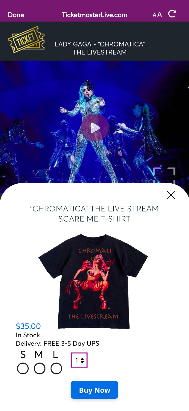
•A new experience that is exciting and that will allow users to support their favorite artist by purchasing merchandise.
•A new feature that will allow our users to have social interaction while enjoying the show.
•We will provide all the information users need to find out about new events.
Prototyping and Usability Testing
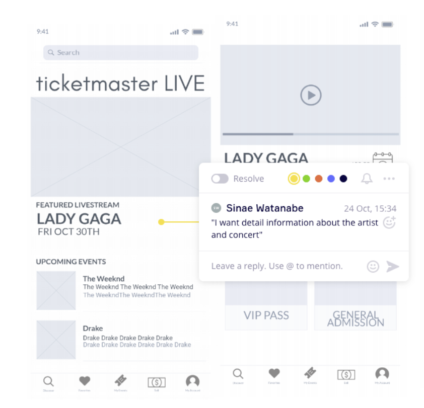
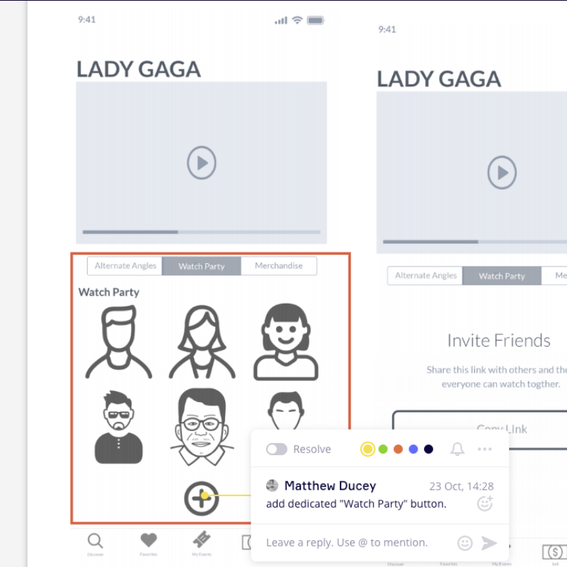
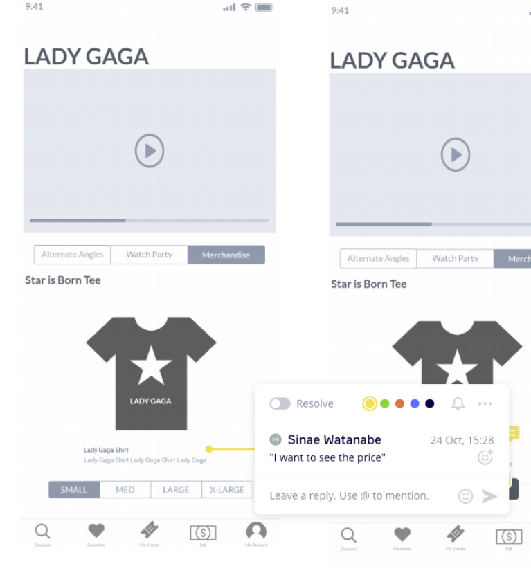
To power up our workflow we created and brainstormed different ideas on Marvel for our Lo-Fi prototype wireframes. We used this tool for the whole team to collaborate at the same time, provide feedback and be in constant communication. It also let us record our users interacting with the prototype for our usability testings and allowed us to iterate/make changes to our design more accurately and as fast as possible.
My design process included multiple wireframes iterations, I used the MoSCoW (Must, Should, Could, Won't) method to prioritize the app features that would satisfy the business and user needs with the least amount of effort. We built our Minimum Viable Product or the simplest product that we could test to see if it should be build in the first place before moving even further.
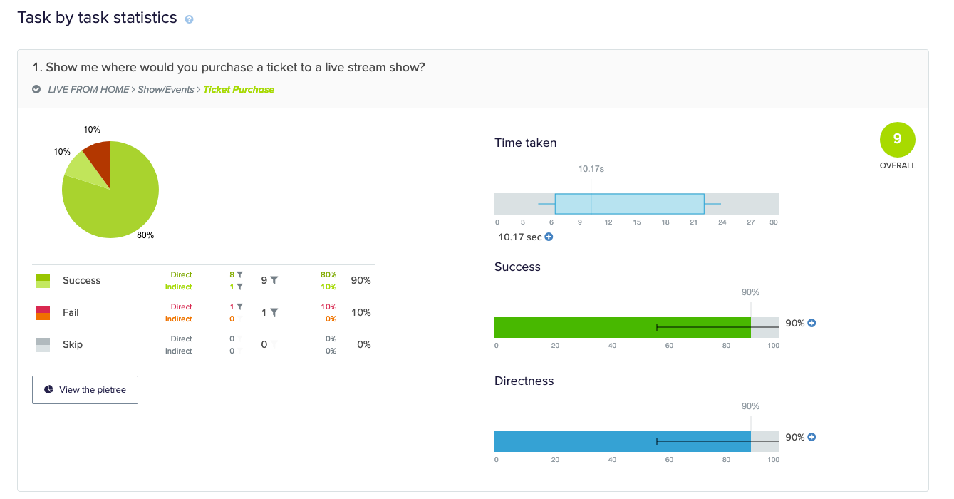
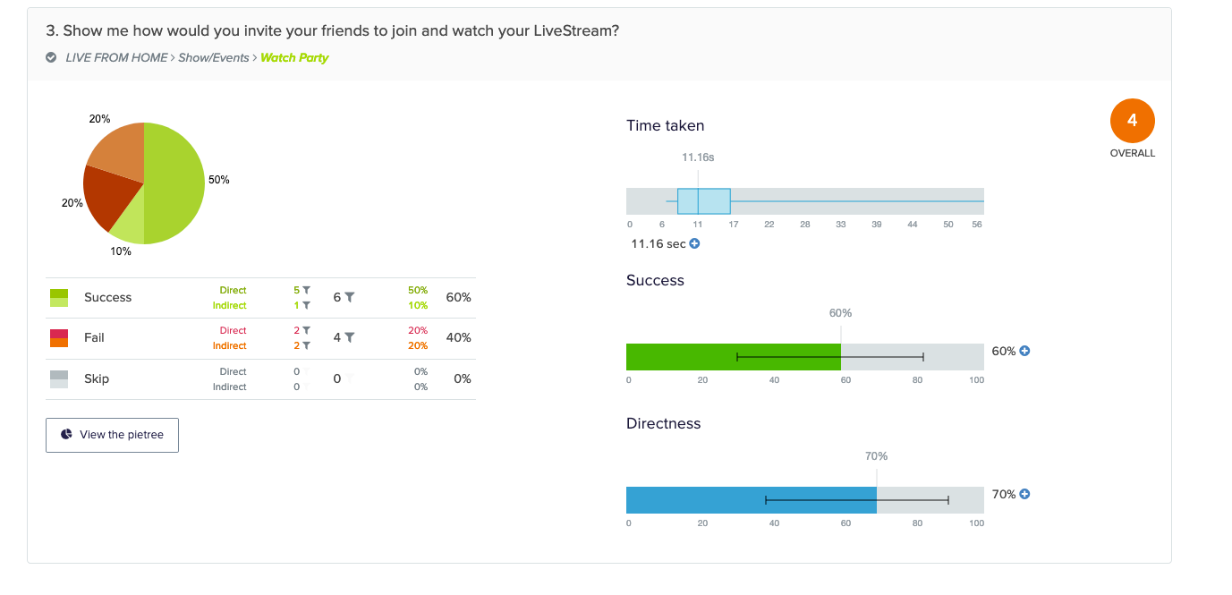
We also ran a "Treejack" study to evaluate the find-ability of topics in our app to build an intuitive way of navigating through the app. Our constant communication and workflow were effective. We had our prototype and results ready, days before we planned to be done with this task which gave us plenty of time to focus on designing the Hi-Fi prototype.
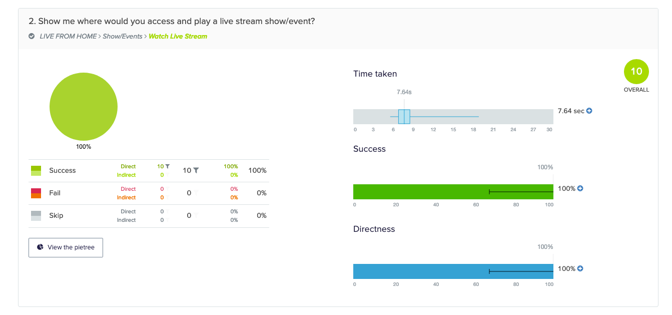
Prototyping and Testing
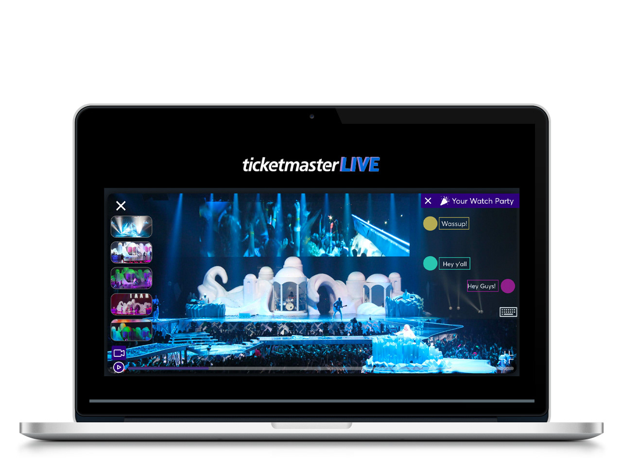
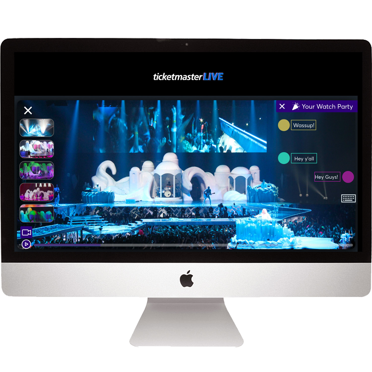
Visual Design Decisions
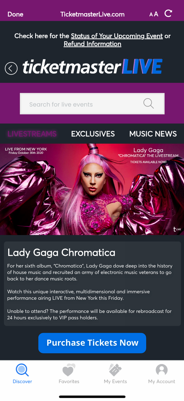
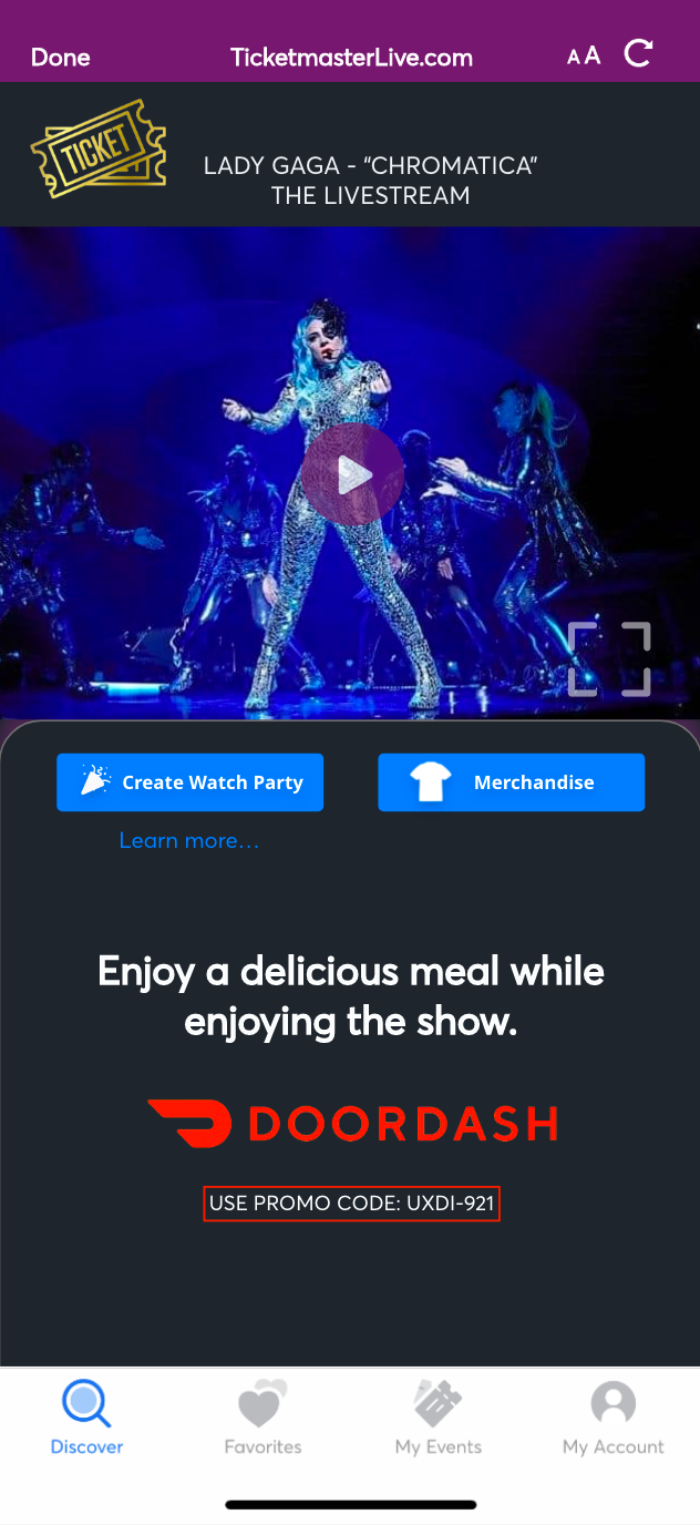
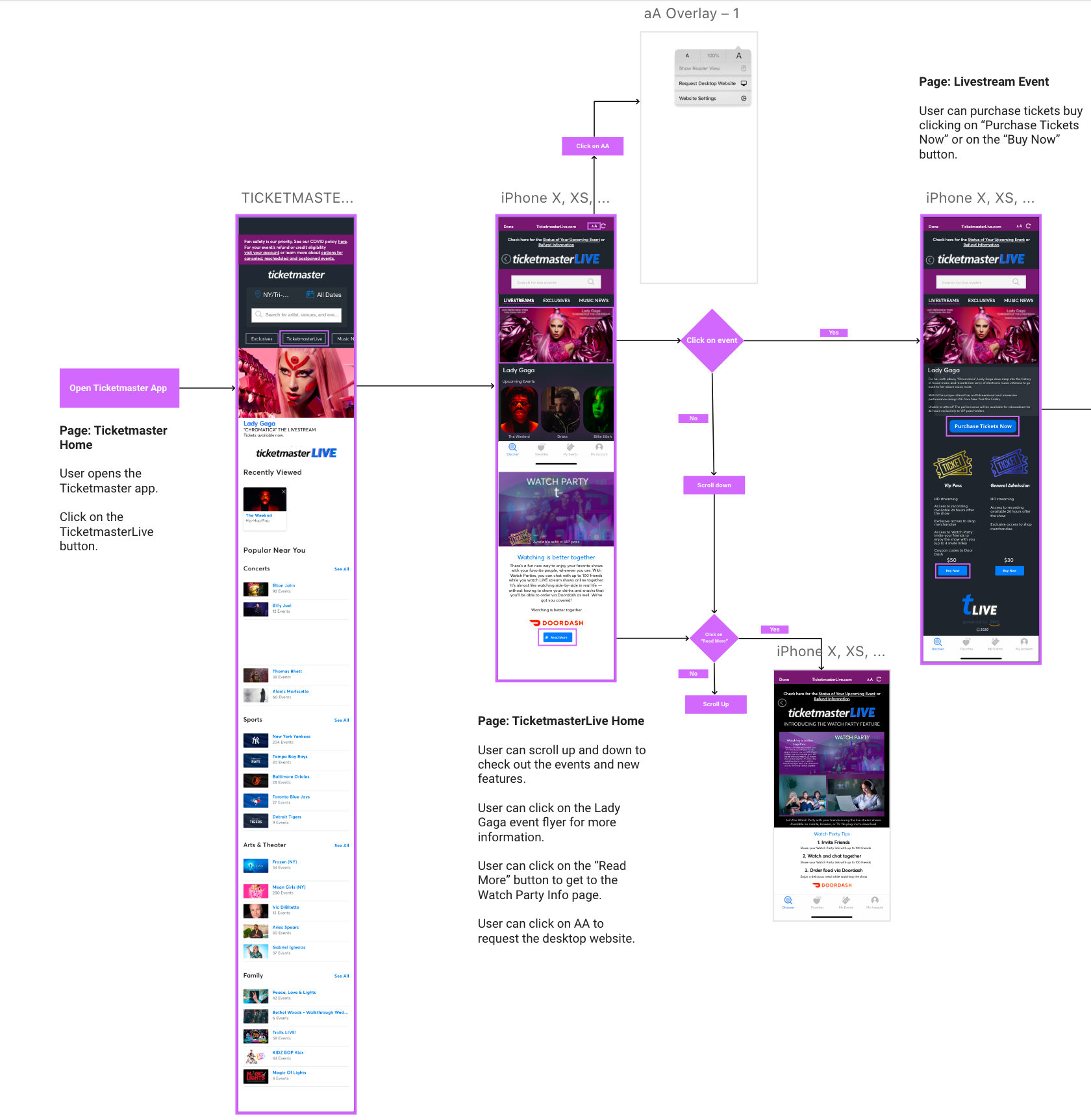
Once you open the Ticketmaster app you'll see the current home and then our integration can be accessed by clicking on the "TicketmasterLive" button. Our research showed that people don't like to download additional apps so we simply gave access to our experience directly from the original home. I also had to take into consideration the Ticketmaster visual identity elements due to the incredibly diverse company's audience.
I applied these elements consistently to create a cohesive experience but with a more hip and interactive twist. Ticketmaster color palette is inspired by the northern lights, bright blues and rich purples that bring a lot of energy and excitement and that embodies the core brand message that "You have to be there live". This was the main concept behind the TicketmasterLive logo that I designed along the banners, flyers and in general the visual design to make our project look as realistic as possible.
The wordmark is the main expression of the brand so I played with the idea of also featuring the globally recognized "T" for one of the logos.
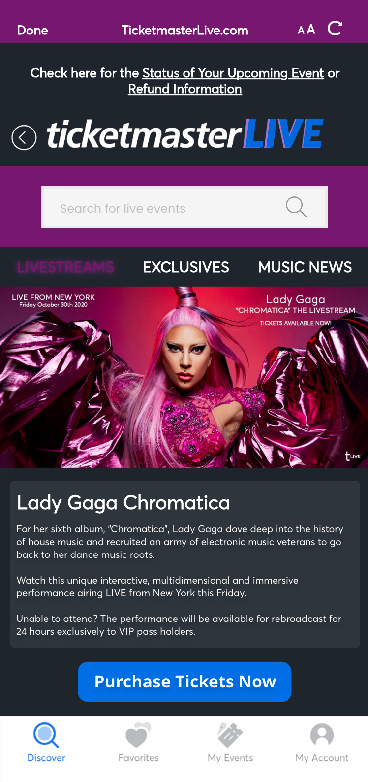

Usability Testing - LoFi and HiFi Prototype
We conducted our usability testings and these were our results:
Lo-fi Usability Testing Findings
•Users want more directions
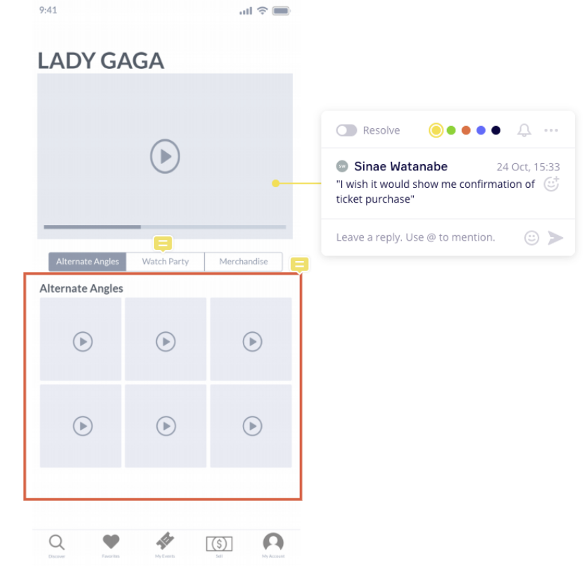
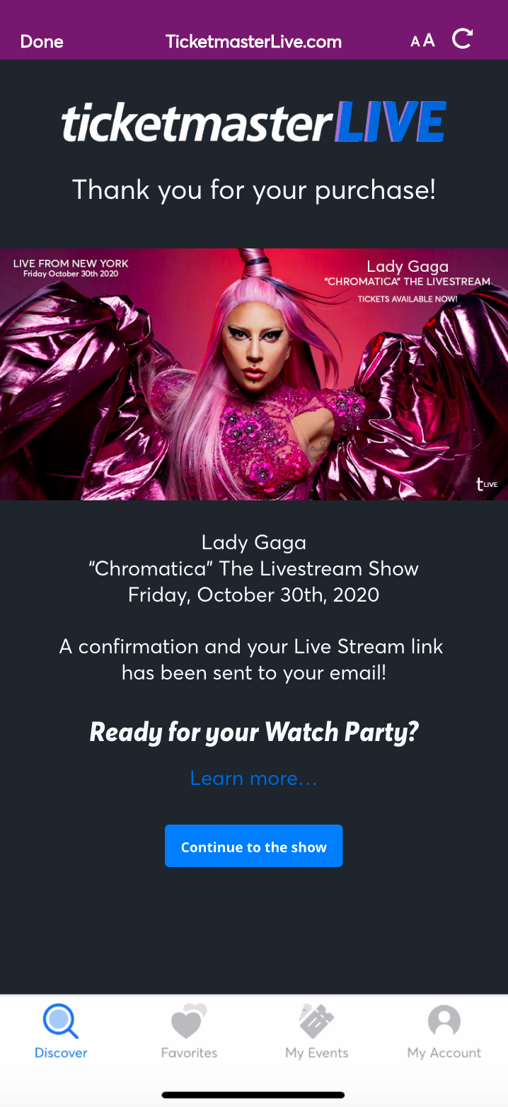
•Users want to see confirmation page after purchasing ticket and merchandise
•Users want to chat with friends
Hi-fi Usability Test Findings
•Users found the confirmation page confusing
•Because of the play button we had initially, users didn’t see it as a confirmation page
•Some users didn’t see the play button, were lost and didn't know where to go next
•User thought getting out of the watch party to buy merchandise was confusing
•Users liked the chat feature
•Users had their preferences on sign-in page
Hi-fi Prototype Iterations

TicketmasterLive Wireflow
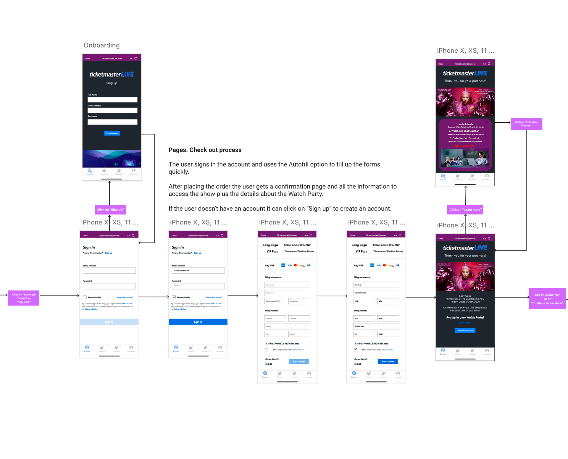
Next Steps for the TicketmasterLive Experience
Outcomes and Results
With this project I learned that communication and collaboration are key to have a successful design process and product.
As a Project Manager it was very satisfying to be able to reach all our goals earlier than planned thanks to our research and our very efficient workflow that allowed us to understand the needs and pain points of our users. We succeeded at providing an easy and pleasant experience while attending live stream events and making our users feel like they can still enjoy themselves and share experiences with their loved ones even during the current pandemic situation. Our users expressed also how convenient and intuitive their experience with TicketmasterLive and that they would use it frequently which showed that by having these features we would generate more revenue not only for the company but for the artists as well while also improving the company's reputation.