WHO IS MICHELLE BLUE?
Michelle Blue is a life and business coach and the host of "The Journey with Blue Show", a talk show that features community leading conversations that help millennial women to create the life and business of their dreams.
PROBLEM STATEMENT
Our team was tasked with providing a better user experience and adding new interfaces, meaning a redesign of the current website (http://www.thejourneywithblue.com), which hosts video content and information on coaching programs.
PROJECT PLAN
MY ROLE: Lead UX/UI Designer, Visual Designer, Researcher and Prototyper.
TEAM: 4 UX/UI Designers and Researchers
TOOLS: Figma, Photoshop, Lightroom, Google Docs, Miro
COMPANY: The Journey with Blue
CLIENT: Michelle Blue, Creator & Host
CLIENT: Michelle Blue, Creator & Host
METHODOLOGY
For this case study, we utilized the following methods during our initial research phase:
These methods enabled our team to obtain an understanding of the target audience, cultivating a strong sense of empathy and allowed us to answer our main research objectives.
1. Heuristic evaluation
2. Competitive analysis
3. Market research & business analysis
4. One-on-one user interviews
5. Affinity mapping
These methods enabled our team to obtain an understanding of the target audience, cultivating a strong sense of empathy and allowed us to answer our main research objectives.
DISCOVER
BACKGROUND
We used generative research techniques to explore the journey users take, both inside and outside our client’s platform, when they decide to investigate and utilize external resources to get advice, and support in their entrepreneurial journey, in order to better understand the challenges and needs faced in these circumstances.
RESEARCH OBJECTIVES:
• Understand people’s reasons for hiring coaching services
• Identify the paths people take when wanting to learn more about coaching services offered
• Learn what stage in the business life cycle people typically hire coaches to help with their business approach
• Determine what is the key guidance/advice people are seeking when potentially hiring coaching services
INTERVIEW PARTICIPANTS & RECRUITING
For our one-on-one user interviews, we recruited eight participants using the following screeners:
• Entrepreneurs (people that already started their own company or business)
• Males & females (predominantly females)
• Age range of 25 to 44
HEURISTICS
• The majority of the heuristics of the current site violated the aesthetic category. This includes the all caps lettering, and overall wordy blocks of text.
• The navigation could work better and look better.
• The mobile screen on the right of this image below, shows how users get to The Journey With Blue website after visiting Michelle's Instagram account and the site isn't responsive.
• The site responsiveness on the desktop version is poor as well, the checkout process is lengthy and confusing and doesn't allow the user to go to another area of the site.
ANALYTICS
• We wanted to use the competition, not only to gain insight, but also as inspiration to give Michelle's business a leg up in the saturated industry of coaching.
• We looked at the current market and checked out multiple websites since the coaching world is growing exponentially so knowing the trends was important to incorporate certain elements and iterate our design.
MARKET
We wanted to get a better understanding of "The Journey With Blue" target audience and these were our findings:
Of the 202 million working age adults in the United States, 33.1 million are in the entrepreneurial phase. Our research shows that people that are in that phase are divided into age brackets. They are either in the 25 to 34 or 35 to 44 years old ones. Since women are the main target for Michelle already we thought it was important to note and let her know that women are co-owners of 45% of all privately registered businesses.
We looked at some of the specific drivers that were leading individuals to start their own business and we learned that there are four main drivers: those being impact, wealth, family tradition and necessity. However, the largest drivers for Michelle's target audience were impact and wealth.
We also saw that people were inspired and influenced by other factors including media coverage, personal relationships, social media and connections to investors.
We used all this market research to recruit participants and guide our discussions with them. We interviewed millennial women that had or had not hired personal coaches on their journey and we used this feedback we received in our interviews to hone in on some key insights.
DEFINE
Using our participants key insights we created a persona that embodied all of the behaviors pain points needs and goals felt by the target audience.
Emma Goldman is a 32 year old entrepreneur based in Brooklyn, New York, and she is the founder and owner of "Simple Truths" an e-commerce based clothing store. She started this business just about two years ago, but she's at a standstill on how to grow her business. She has several ideas but doesn't know how to efficiently and effectively prioritize and implement them. She needs help pinpointing and overcoming her specific blockers, as well as expanding on and developing her niche market.
DESIGN
After we had some meetings with Michelle she mentioned that it was important to her to make a reference to her last name, "Blue", and use that as the main theme for the new website. As the Visual Designer for this project, and after showing different mood boards to her, I created a color palette that included airy blue, golden and neutral colors to give a clean look and create nice contrasts on different elements through the website. I took inspiration from the sofa that she used to interview her guests for the third season of the talk show that she will be launching this year. I picked Montserrat and Spartan as the main fonts for the website and we made the decision that her logo also needed to evolve in order to match the new and more mature look that Michelle was looking for. I also edited each photograph that Michelle provided for this project on Lightroom.
I decided to design a Mid-fidelity prototype to be able to help users visualize the concept of the website better so I included some colors and images. To create this experience I had to take into consideration Michelle ideas as well. She pinpointed the elements that she thought were a main priority for her and that needed to be included for sure in the design:
1. A landing page with an email capture popup
2. A home page that will include as much information about Michelle's background and previous speaking commitments like her TEDx talk and partnerships with other media platforms and companies
3. A video gallery that will feature her talk show, including her new season, previous episodes and other content
4. A way for users to contact her and schedule phone call appointments
5. A way for users to subscribe and download her free materials
6. A checkout process (which I had to simplify to a one-step experience because the current website has multiple steps that don't make sense to just purchase the coaching program)
7. The coaching program information
8. Testimonials from her previous clients
After testing our Mid-fi prototype these were our findings and after we got those results I worked on the iterations for the Hi-fi prototype:
Testing the Mid-fi prototype on Figma via Zoom
HI-FI PROTOTYPE INSIGHTS:
• I blurred out the home landing page to expose the email capture popup and to avoid confusion.
• After Michelle approved the new logo I wanted to keep it at the header without compromising the photos in the background, so I gave it a bold finish to make it more visible.
• There was an issue with the “Sign Up” and “Subscribe” call-to-action buttons. There was a bit of confusion and users didn't understand what they were signing up for and subscribing to. I changed the "Sign Up" button to “Enroll Now” to make it more clear for the users that by clicking there they will be purchasing the coaching program with Michelle. For the "Subscribe" button I mentioned the YouTube channel in the talk show information so they will understand that by clicking there, they would be subscribing to her channel.
• Some of the users had trouble reading the content so I adjusted the headers and body text throughout site to make it more legible and consistent.
DELIVER
Click on this video to see a walk-through of the Figma prototype

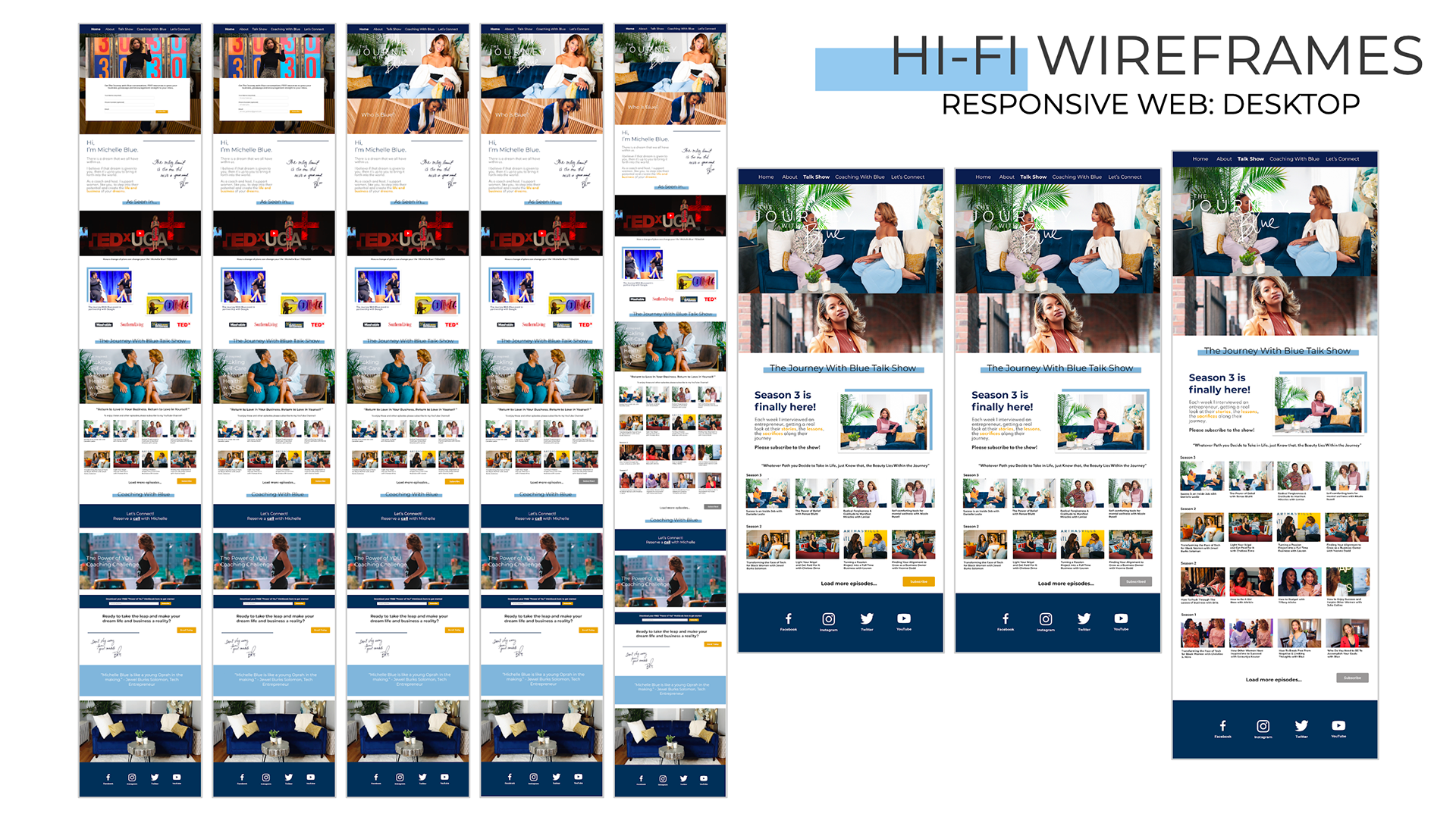
Home Page with email capture popup, Home Page Screens, Video Gallery Screens

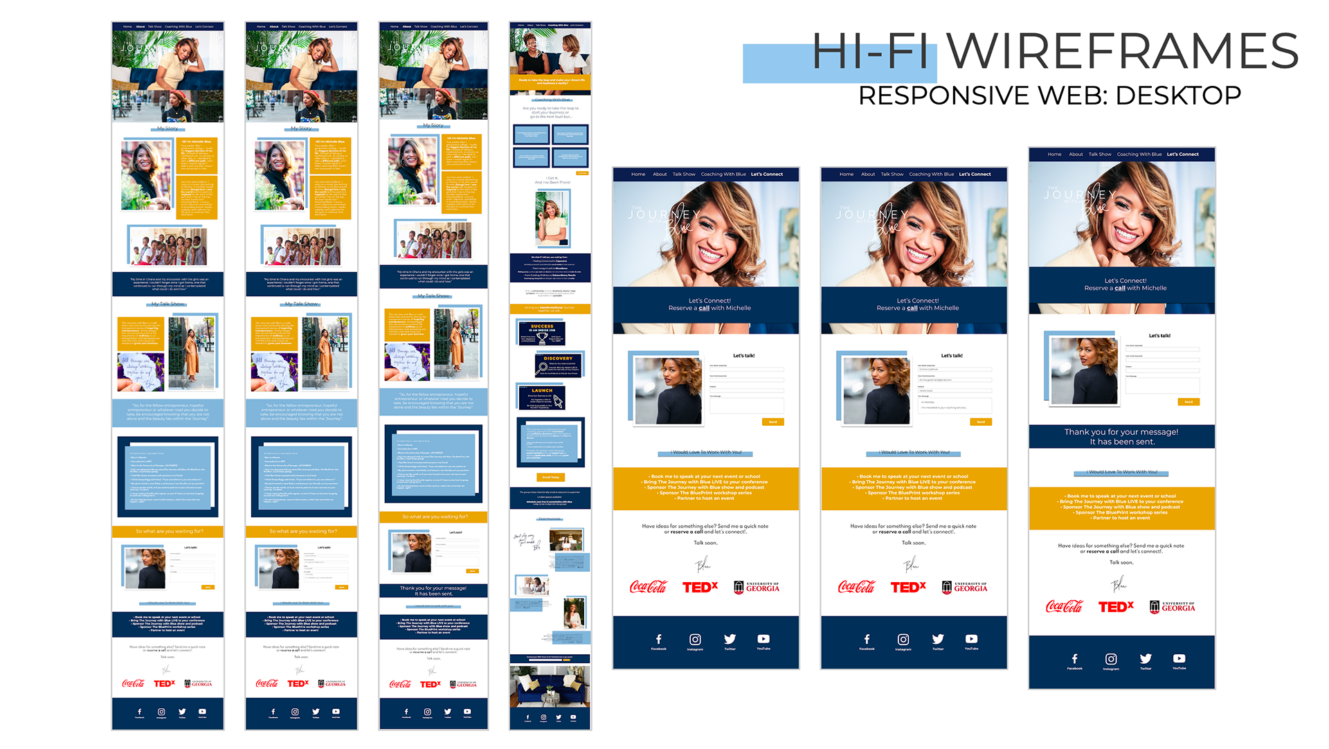
About Screens and Let's connect Screens

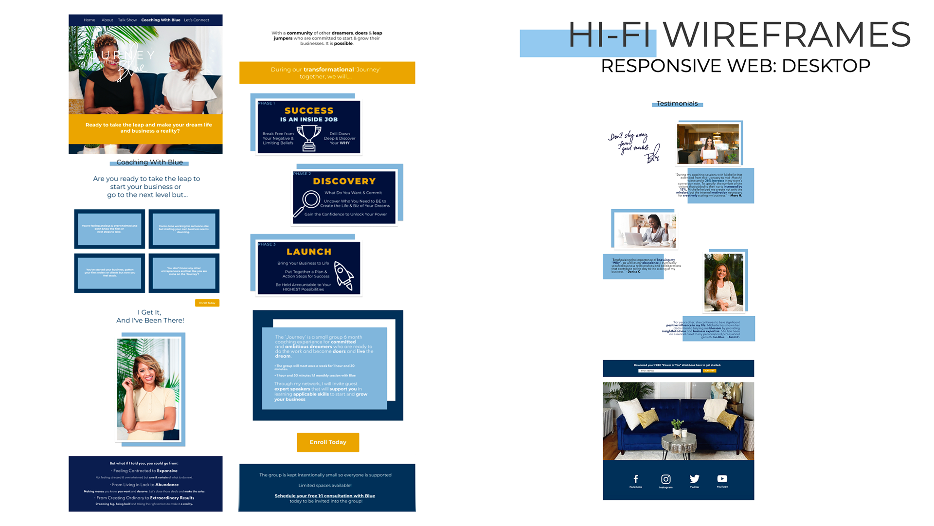
Coaching Program Screens with Testimonials

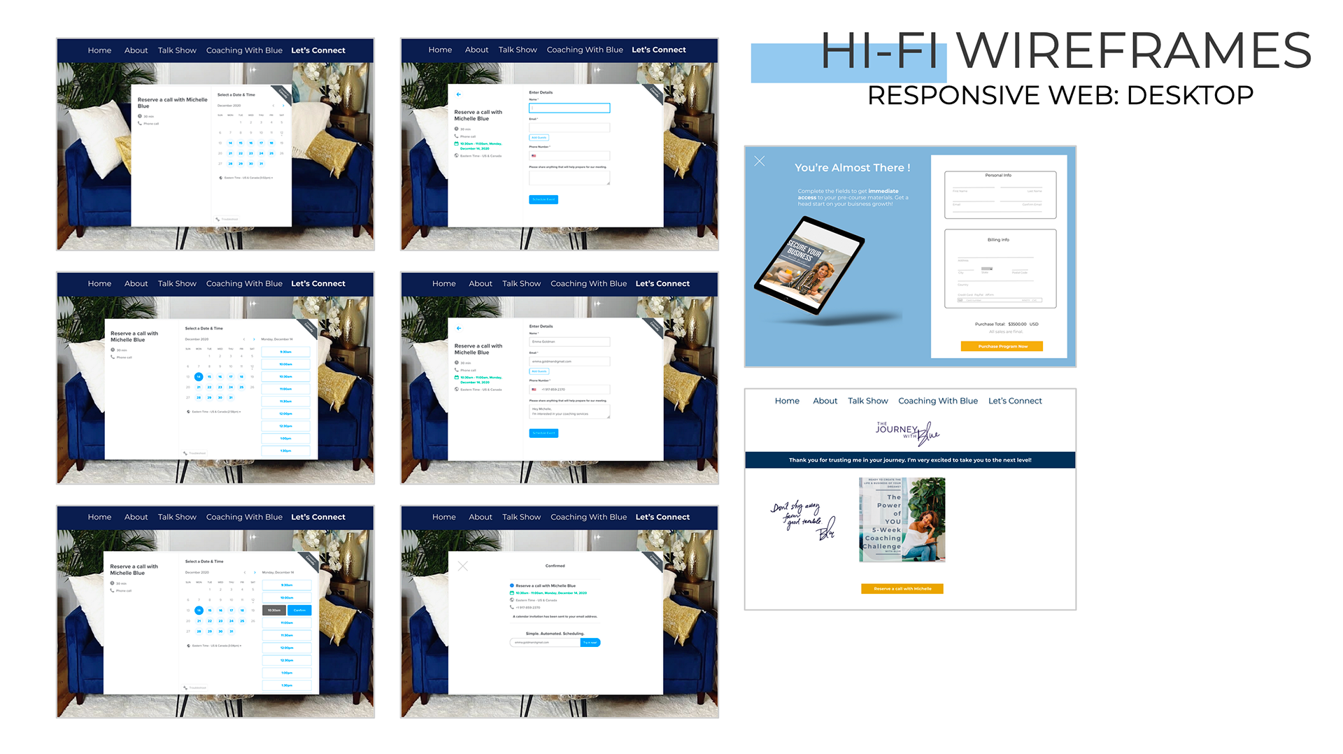
Calendly Screens and Checkout process Screens
OUTCOMES & RESULTS
This project was challenging for me because we weren't able to be in touch with our client as much as we wanted to. We had less than one month to work on it and we had to take some days off for the Thanksgiving holiday. It was also hard for our client to define exactly the services she offers as a coach because she has been mainly focusing on being a host for her talk show. The coaching industry can be confusing and hard to understand for users as well and the lines between business and life coaching seem very blurred. It took multiple conversations and team meetings to finally understand what Michelle wanted to focus on, her concept, and mission and to clarify the services she provides.
As a team we worked on separate tasks to try to find a workflow that was efficient and concise. I learned that constant communication, patience and perseverance were key to make this project a big success.
Our client Michelle Blue was satisfied and delighted with the results and she will be working with a developer to update her website to the experience that I designed. We achieved all our goals and this project was a success.