Bushwick Bark Website Redesign
The "Bushwick Bark" is a healthy pet food and supplies shop that also offers grooming and self-serve dog wash services in Brooklyn. With a passion for animal welfare and rescue, it serves as a community resource for all animals, hosting fundraiser events and donating all the proceeds to local rescue organizations. Currently their website doesn't allow customers to buy products online (lacks a checkout process) or book any services digitally. All sales are conducted via phone or in store.
My role: This was a solo project so I was the main Project Manager, UX Researcher, UI Designer, Visual Designer and Prototyper.
Tools: Marvel, Sketch, Photoshop, Miro, Zoom, Google Docs.
Methodology: Heuristic Evaluation, Research: User Interviews (eight participants), Competitive and Comparative Analysis, Prototyping and Usability Testing.
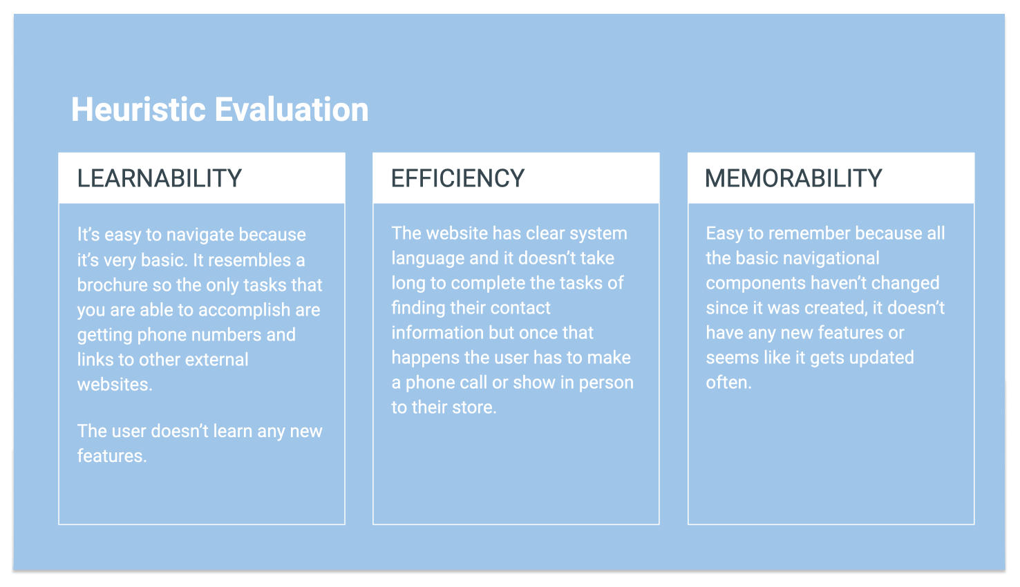
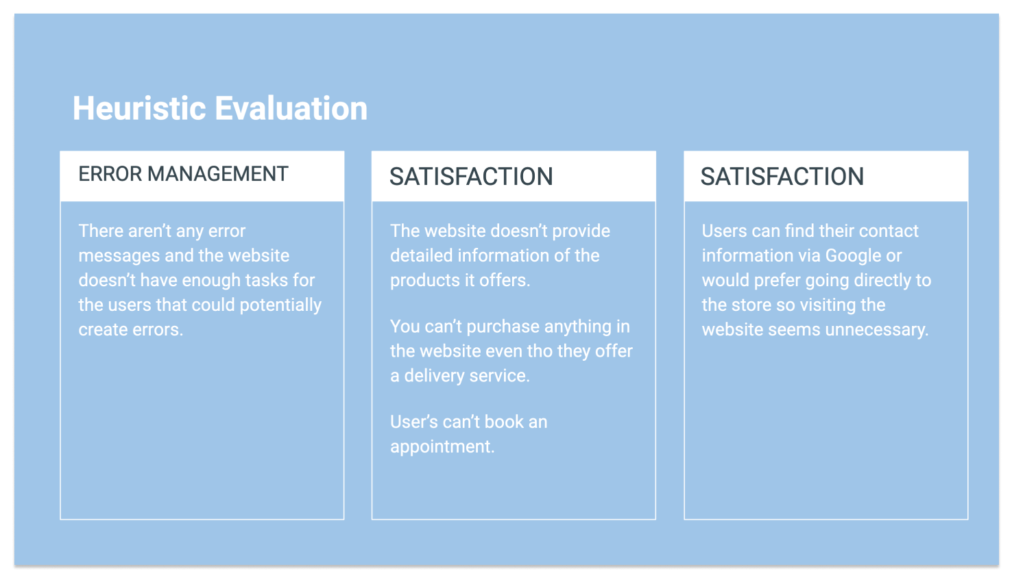
To get this project started I analyzed the current website www.bushwickbark.com and performed a heuristic evaluation to be able to identify the current usability issues.
Using the Jacob Nielsen five quality components: Learnability, Efficiency, Memorability, Error Management and Satisfaction, these were my findings:


Competitive Analysis/Feature Inventory
I did an assessment of some of the most important features that a few of the Bushwick Bark direct and external competitors currently offer in their websites as inspiration for my project. I had to learn what these competitors are currently offering and their faults to be able to innovate and design an original solution for this project.
My conclusion after this evaluation was that the “Bushwick Bark” desperately needs a proper online presence and shopping experience to be able to retain their customers, satisfy their needs, and generate more revenue. Compared to other similar companies, they seem extremely behind, lacking many features and elements that will allow users to navigate through the website.
I decided to do some user interviews to find out the shopping habits and preferences of pet owners, how valuable they find their pets and these services, as well as how frequently they shop online and what are there current favorite pet supplies websites.
User Key Insights
Persona
"Oscar is my child!"
James Hill, 27, Architect at ODA, New York
James Hill, 27, Architect at ODA, New York
And James is not alone in that sentiment...
In a recent survey, 80% of pet owners said they care for their “Fur Kids” as if they are real children and spoil them just as much as if they were human kids.”
User Journey Map
With this Journey Map we can understand that the current path that James follows ends in feeling frustrated. He wants to support the "Bushwick Bark" because it's one of his favorite stores but he doesn't have the time to go there in person or to talk on the phone each time he wants to order food or pet supplies. Bushwick Bark is one of the only stores that carries the specific brand of food James needs. He also trusts their grooming services above all others, but with only a phone number listed on the website, James finds it difficult to keep up with scheduling regular appointments.
Current Bushwick Bark User Flow
Problem Statement
My solution
“I believe that by creating a new optimized website that allows customers to shop online for pet products and services in a quick and easy way while also offering discounts, I will help James save time and money”
User Flow - Optimized Bushwick Bark Website
Lo-fi & Hi-fi prototypes
For my design process I decided to research current e-commerce design trends to get inspired and brainstorm different ideas and then sketch the wireframes on paper. With those sketches, I created a Lo-fi prototype on Marvel to conduct my usability testing. After considering all the insights I received from conducting the user interviews, I decided to focus on these features:
I tested my Marvel and Sketch prototypes with eight users via zoom and one in person with the paper prototype.
All of them made comments about how great and appealing the website is, how easy it was to find the products and they reached their task in less than 1-2 min.
One recurring issue I noticed during my testing was the confusion after the product gets added to the cart. Once the user receives confirmation for that action and has to proceed to checkout I thought it would be a good solution to give the user three options:
• A guest checkout (for the fastest option but would exclude them from receiving the rewards and discounts).
• A register option with an explanation of all the subscription benefits the user will get upon signing up.
• A returning customer sign in for users that already have completed the registration process.
Usability Testing Findings:
My findings showed that it wasn't clear to users that they had to click on the "Register" title/word in the Lo-fi prototype. In addition, they didn't understand that clicking this option (similar to the selecting "new customers") would allow them to receive all the discounts and benefits so I created a few iterations to that design, turning the title into a button to call for action in a more recognizable way so users would know instantly that they need to click on that.
Users were able to use the search bar as well as the product menu to find what they needed. They thought the website was very easy to use and that the checkout was intuitive. They achieved all the tasks they were given and they enjoyed the experience overall.
Testing the Hi-fi Prototype on Zoom
Click on this video to watch the prototype
Persona Storyboard
Visual Design Decisions
For this project I created a mood board that would reflect the experience a customer would have, should they choose to visit the Bushwick Bark store in-person. The use of bright colors was inspired by their logo and by all the products displayed throughout the store. I thought it was very important to keep that same vibe and create a palette that would make the website as friendly and fun as possible so new and returning customers alike would enjoy the experience and continue shopping online.
I used this color palette on many elements throughout the website to create a clear and simple language that would allow users to navigate with ease. I chose Roboto as the main font in favor the current selection which was small in size and difficult to read.
Outcomes and Results
This project was quite challenging for me because I had to create a new experience almost from scratch. The current Bushwick Bark website is obsolete and doesn't reflect the positive impact that the store has in the neighborhood. This is my favorite pet store in New York and I've been a loyal customer over the years but at times I haven't been able to support them. I can't go to the store in person every time I need to get pet supplies and due to the current pandemic situation I think the store would benefit enormously by having a website that allows to shop online. That's why I picked working on this project.
My research was extensive aside from the user interviews and the heuristic evaluation to be able to learn more about the industry and understand what are the design trends and features that make other pet supplies companies so successful. I also wanted to provide a friendly experience without overwhelming the users and show them more than anything that the Bushwick Bark truly cares about their pet parents community.